
In corporation with DDP Collection, we developed crafted products that shows the culture and dignity of Seoul.
Product design
「 Crafted products with the dignity of Seoul enriches the lifestyle of people and the society. 」
The main theme of DDP Collection 2019 is ‘Seoul Life’. Seoul life is a lifestyle that has become more affluent, reflecting Seoul’s culture and character in everyday products that symbolizes food and shelter(食, 住). We wanted to make a simple and concise product that can bring happiness and rest to modern people’s lives reflecting on Seoul life. Along with the healthy and elegant consumption, we came up with three keywords that were derived in line with consumption trends and lifestyles that prefers specialized and maximized individual satisfaction. The three keywords are ‘Healthy Seouler’, ‘Warmth beside me’, ‘Little happiness of everyday life’. ‘Healthy Seouler’ derived from using sustainable materials and high quality material. Objects that are used for eating and living is not only functional but also formative existing as an art piece around us.
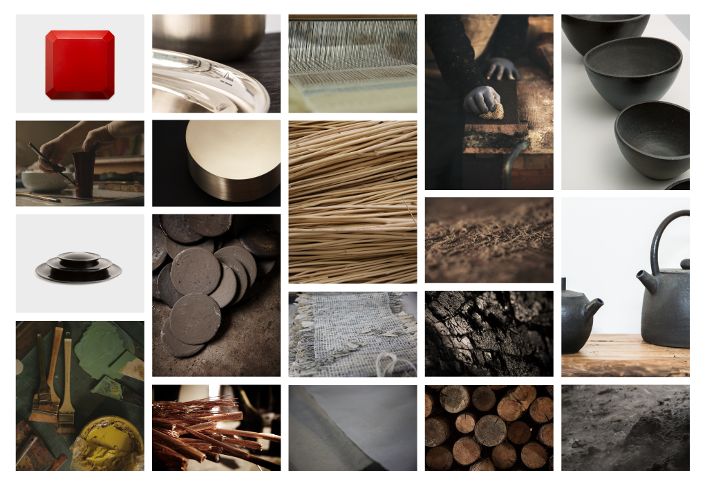
Also consumers don’t always consider the product itself, they purchase the brand philosophy which is consistent with their own beliefs. And that consumption enriches their life and culture and even the environment. On this basis, we established a brand philosophy that can be given back to the environment and the society. Our philosophy and goal is to find use from old materials and developing products that circulates the resources. We selected 5 materials that reflects 3 values (The survival value of nature, Wisdom and future value, Preservation value of Technology) that derived from resource circulation and applied them to the products of DDP Collection 2019.
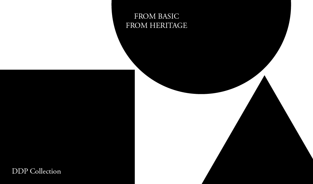
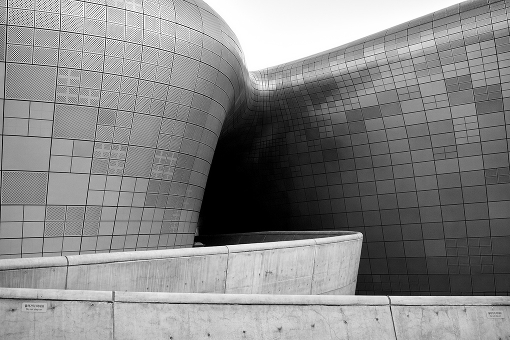
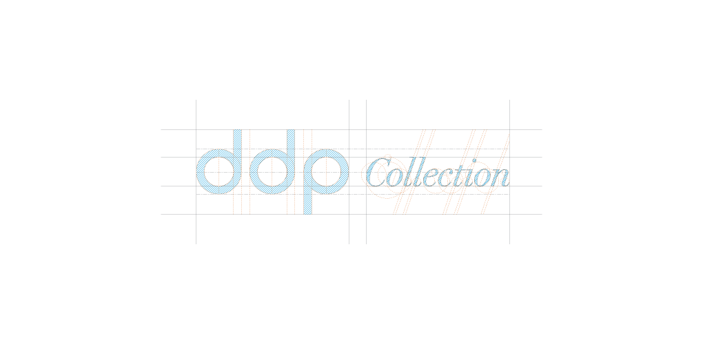
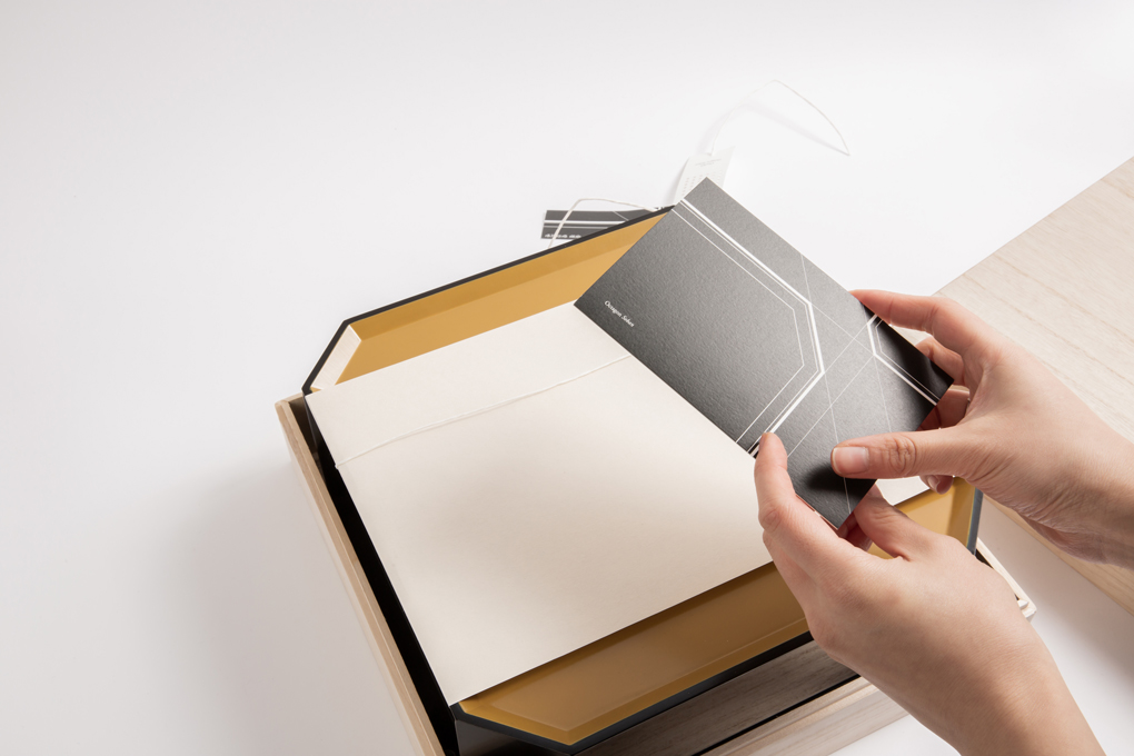
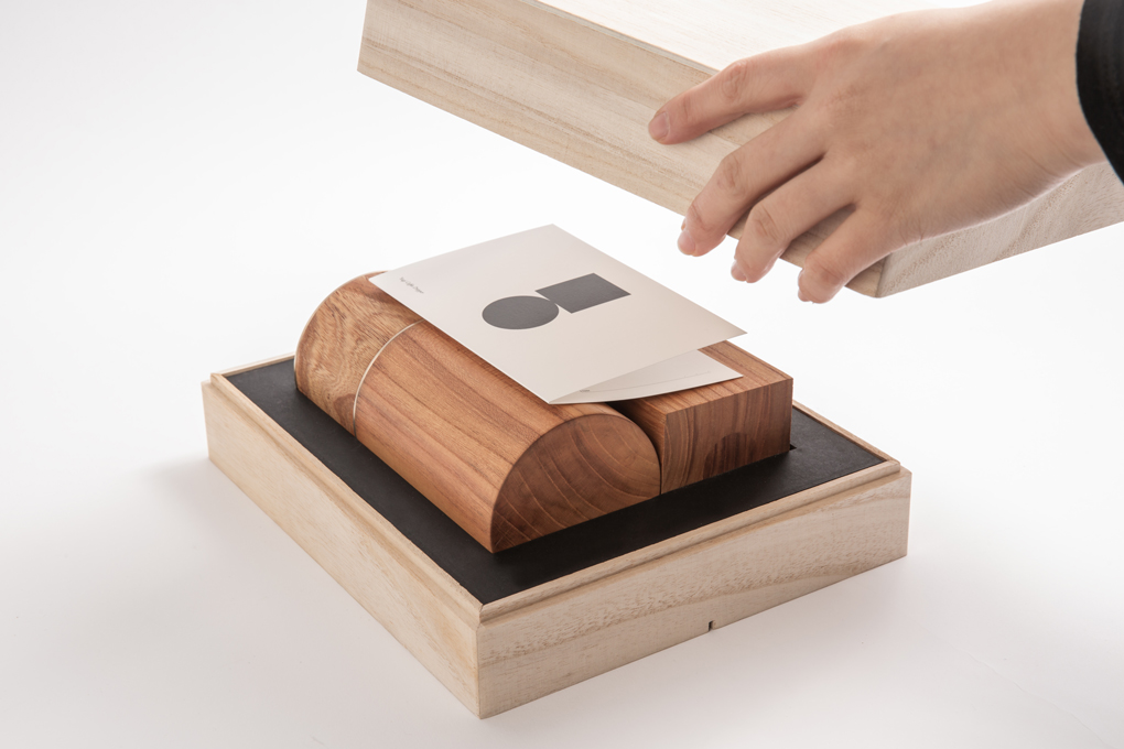
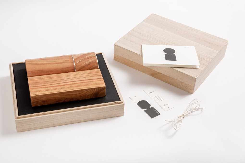
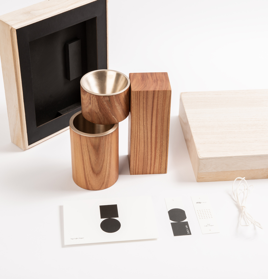
The DDP Collection is a collection of the most basic natural materials and natural forms. The main graphics of the DDP Collection feature DDP and DDP Collection products. The six rows of circles arranged neatly used the most basic natural form, the dot on the outer walls of the circle and the DDP, as the main. The product's artwork visually has an impact on the product's outstanding features. We used black and white, the most basic of all colors, as the product derives from the most basic form. The overall color is white and black, with maximum exclusion of the color to make the texture, shape and product stand out. The logo of the DDP Collection was produced in wordmark using the existing DDP logo. We designed 'Collection' by transforming Didot Italic, which has a classical and luxurious atmosphere. The entire typography used classic serif fonts such as the Garamond.
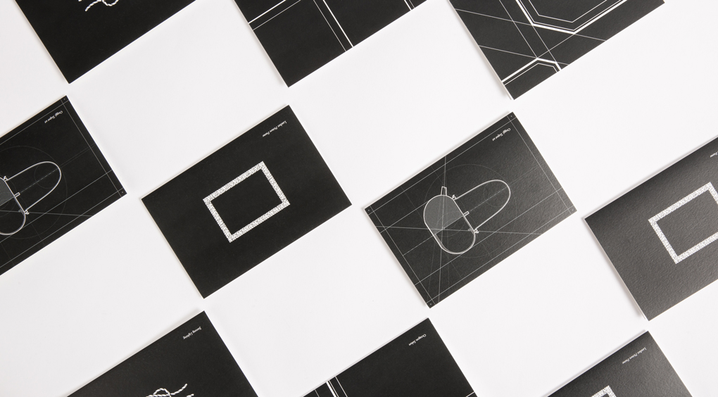
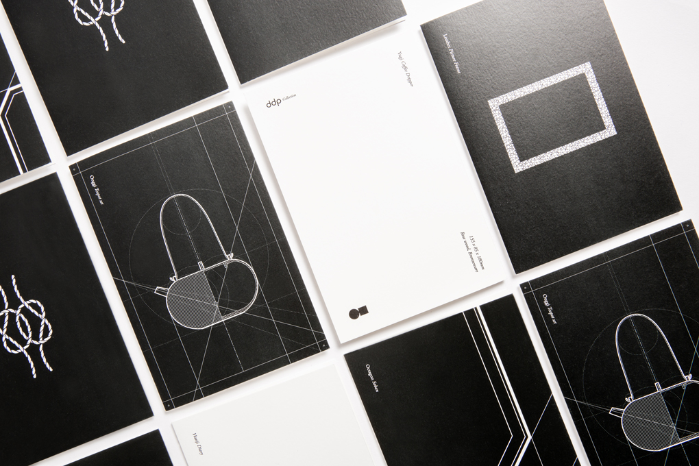
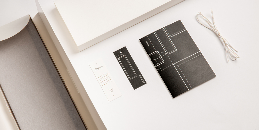
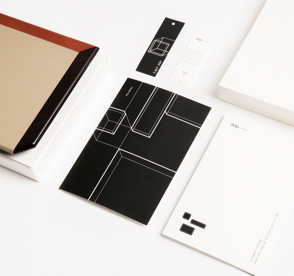
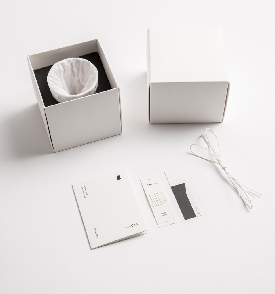
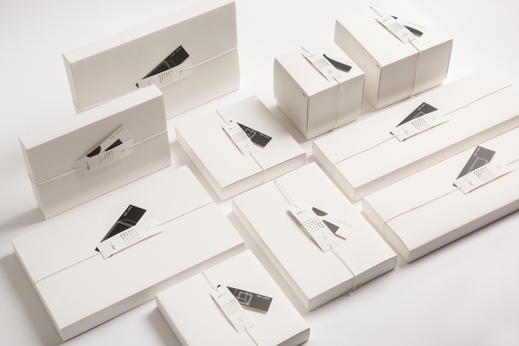
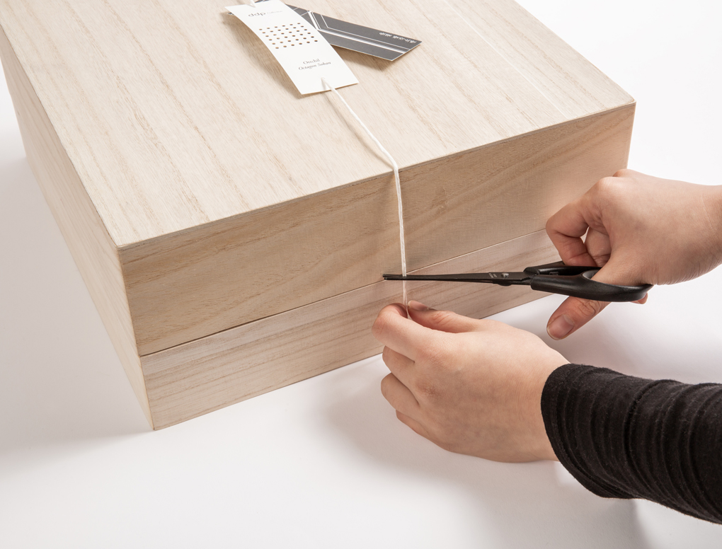
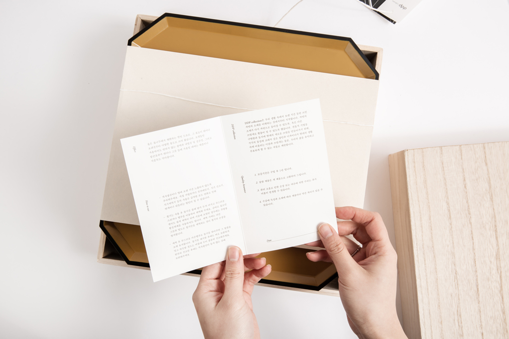
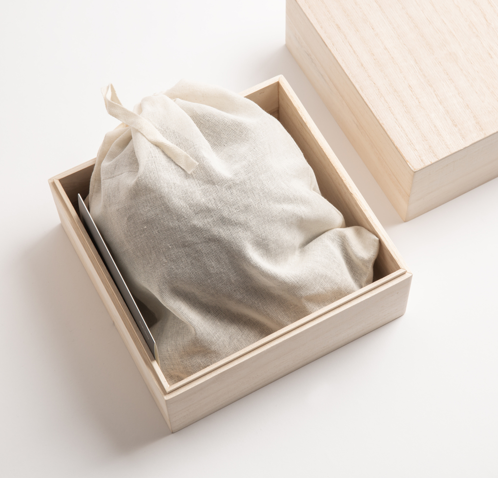
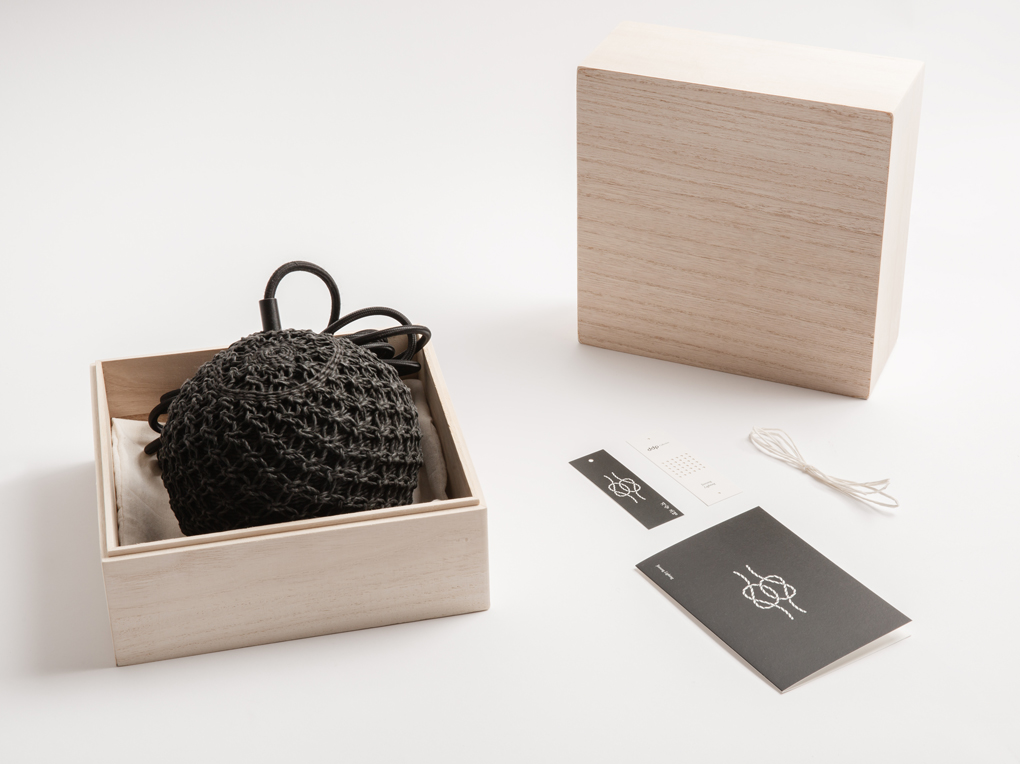
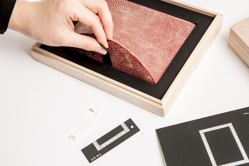
The package used natural materials such as paper and wood. Materials were selected to suit the characteristics of the product. Both paper and wood did not have coating-like finishing to give a natural feel to them. The label is located in the center of the upper face of the paper box and wooden box. We designed two kinds of labels. Perforated label include product names and brand logos. Artwork label include product’s artwork.

Client : DDP, Seoul Design Foundation
Project name DDP Collection
Date 2019
Client DDP, Seoul Design Foundation
Previous Project Jeonju Hanok Village Luxury Hall
Next Project DDP Collection, Leatherware


