
We designed and created the brand identity of FIOTHUS, which provides Project & Logistics Solutions.
Brand Identity
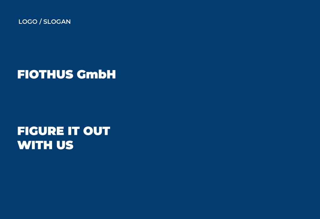
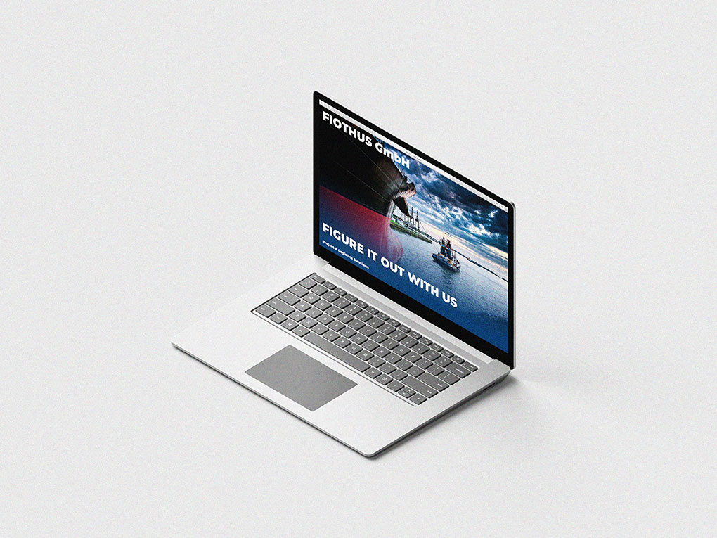
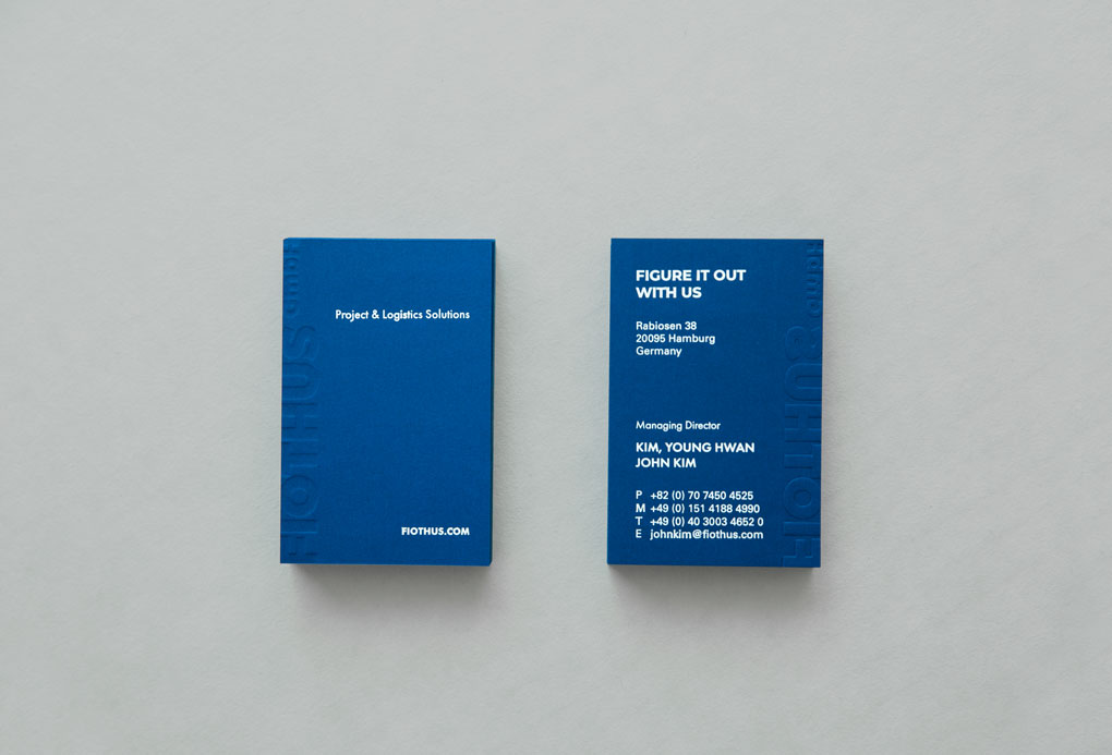
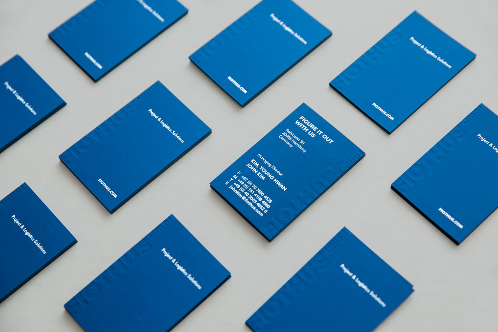
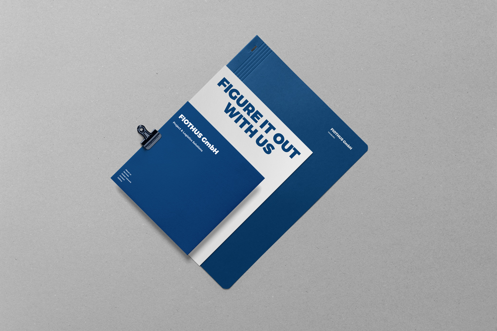
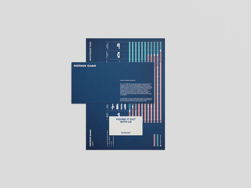
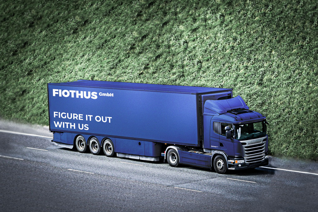
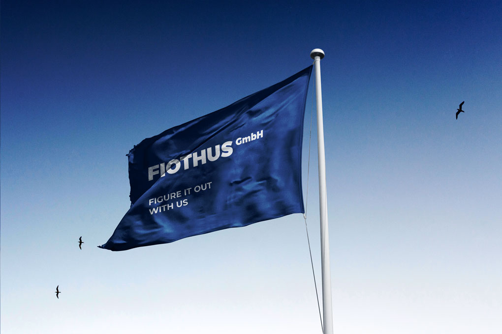
“Figure it out with us”
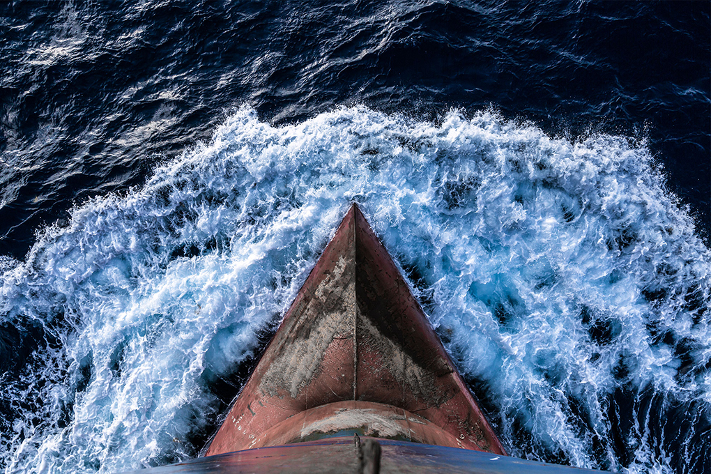
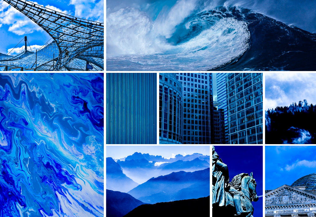
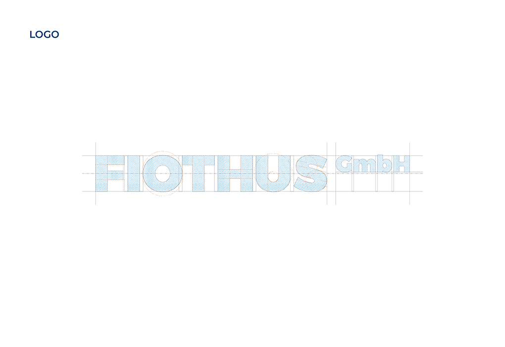
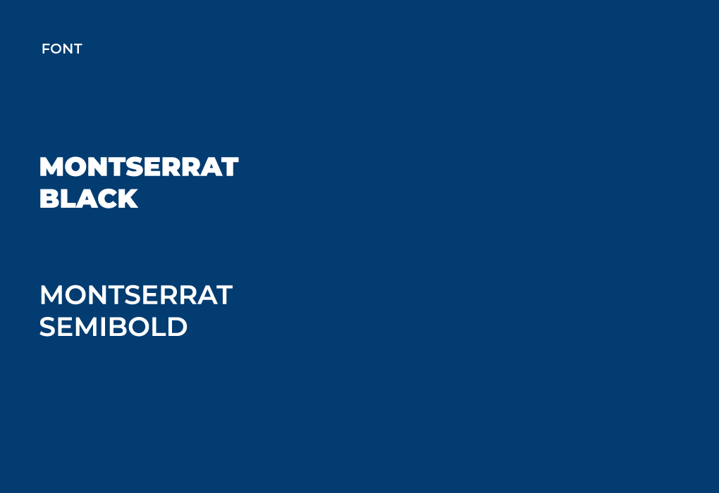
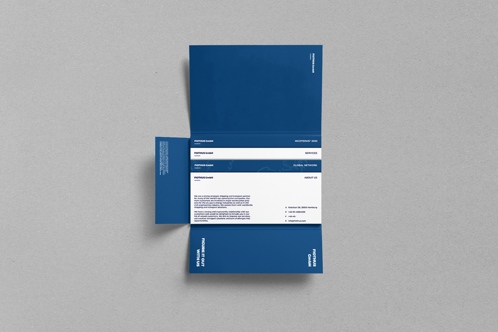
We designed and created the brand identity of FIOTHUS, which provides Project & Logistics Solutions. FIOTHUS has the image of Wonder Woman. The brand's philosophy is its special ability and delicacy that others don't do well. For this clever brand, the main color was chosen as the calm royal blue. Royal blue is a calm and intelligent color, but it also symbolizes the sea. The font used Montserrat to show a bold image of FIOTHUS. Bright white letters contrasted with dark blue help deliver clear information.

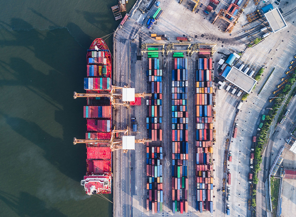
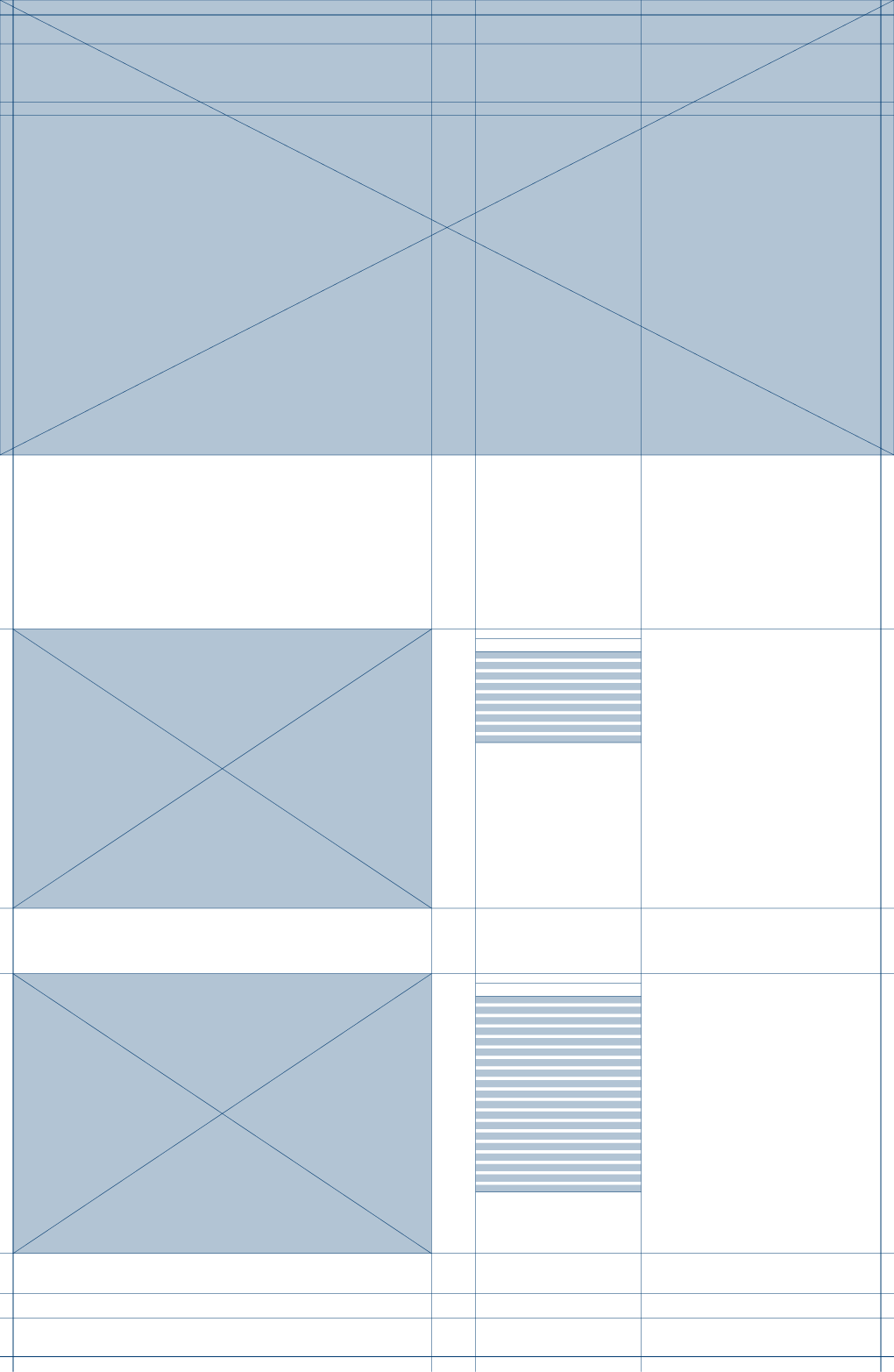
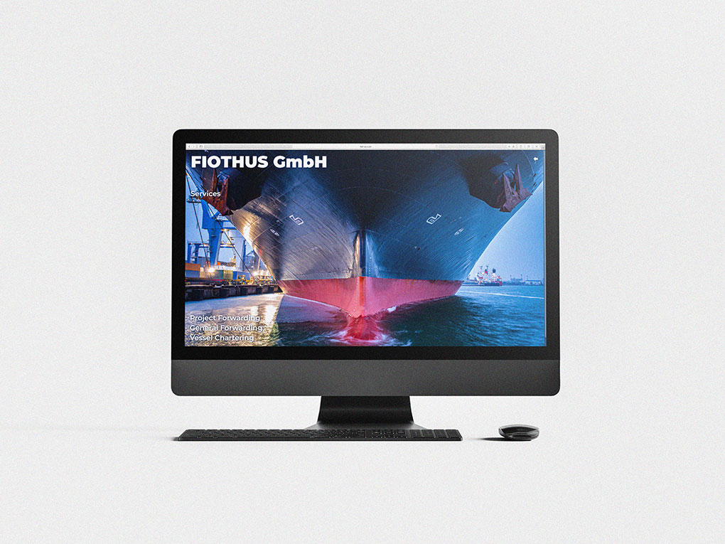
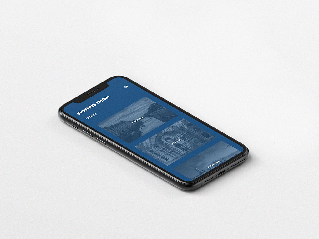
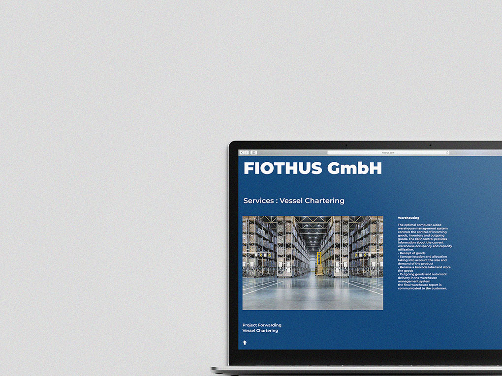
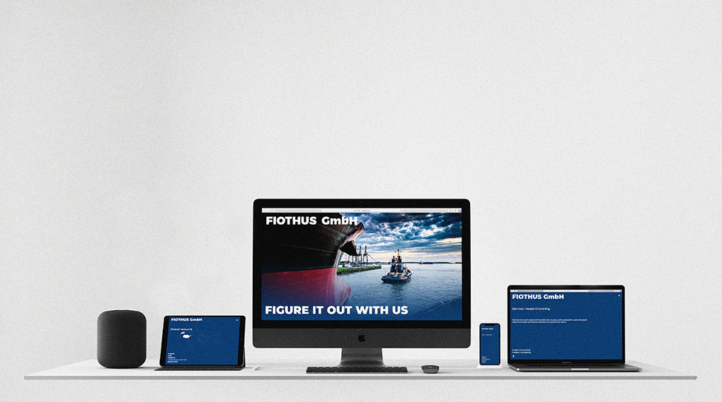
FIOTHUS' website is concise and clearly designed. We used the images related to FIOTHUS' work to help them understand. It is designed to make the Web environment lighter so that users can reach information more easily. It has relaxed the elements of web design, which are commonly used, and created a bold yet clear atmosphere. It is produced in a reactive form that can be used in multiple environments.

Client : FIOTHUS GmbH
Project name FIOTHUS GmbH
Date 2020
Client FIOTHUS GmbH
Previous Project National Aviation Museum of Korea
Next Project Samsung city


